Apple’s UI Design: From Lickable Skeuomorphism to Legendary Minimalism
Summer of 2020. Apple drops a new version of macOS, and if you weren’t paying attention, you might have missed the remix. They pulled features straight from iOS—Control Center, widgets—but the real story was the icons. At a glance, they mimic the mobile shape and palette. But look closer. There’s something uncanny about them. They have the abstract glyphs of the modern era, but they’ve got depth. They’ve got shading. The tech blogs called it "Neomorphism," a subtle nod to the visual history of OS X. It’s Apple trying to bridge its two most important platforms without admitting they’re running out of new ideas. It’s a sign that UI design is heading somewhere new. But to understand where we’re going, we have to look at the old tape. Specifically, the era from the early 2000s to 2012. The Scott Forstall era.
To understand where this "Neomorphism" comes from, you have to go back to the late 90s. Apple was on the ropes. I’m talking 90 days of cash left in the bank. They were effectively hemmed up. Steve Jobs returns in ’96 like the prodigal son, and he knows he needs to cut the fat. He needs a hit. He wants a sleek new interface for the next Mac OS, and he plans to use the tech he developed at NeXT—the company he started when he got kicked out of the kingdom the first time. To handle this, he taps Scott Forstall. Forstall had been with Jobs since ’92. He was the young gun. He had talent, ambition, and a flair for the dramatic that Jobs respected. Real recognize real. Forstall later spilled the tea on his interview with Jobs. Steve told him, “I don’t care what anyone says, at the end of the day I’m giving you an offer.” But then he told him to pretend he was interested in everyone else’s questions for the rest of the day. It was a performance. A con game. And Forstall was ready to play. They became tight. They agreed on philosophy, culture, and most importantly, design.
The "Lickable" Interface
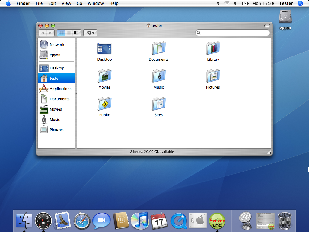
When Jobs wanted a new design language, Forstall delivered "Aqua." It dropped with Mac OS X in 2001 and it looked like nothing else. Buttons looked like beads of water. It was glossy. It was excessive. Jobs famously said, “One of the design goals was when you saw it you wanted to lick it.” That sounds wild now, but context is key. Windows had drop shadows that gave the system depth, sure. But Apple’s icons looked like perfect representations of real-world objects. Perspective, lighting, texture—it was all there. This was likely influenced by Jobs’ time at Pixar. He saw Toy Story, saw what computer-generated rendering could do, and decided his operating system needed that same level of polish. As time went on, they doubled down. Brushed metal in 10.3. Reflective surfaces in 10.5. Leather textures in 10.7. It wasn't just software; it was digital drag.
The Skueomorphic "Bridge"
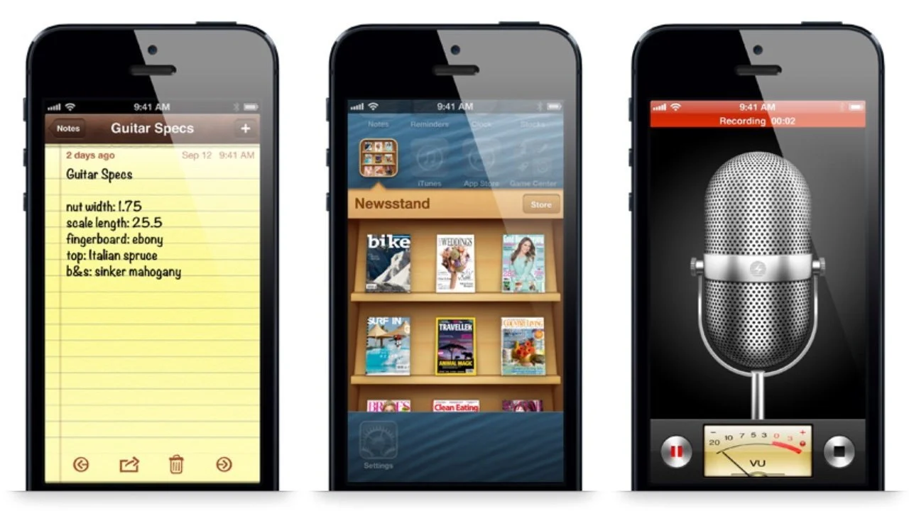
When it came time for the iPhone, Jobs put Forstall in charge again. And Forstall ran the same play: gloss, texture, metal, wood. Forstall was obsessive. We’re talking about a guy who kept a jeweler’s loupe on his desk to inspect every pixel of an icon. He demanded perfection. With the iPhone and iPad, Forstall pushed for apps to look and act like their real-world counterparts. The Notes app looked like a legal pad. The Contacts book looked like a spiral-bound notebook. Forstall was so committed to the bit that he refused to make the book full-height in portrait mode because a real book wouldn't look like that. This is called Skeuomorphism. It’s a design that references a past incarnation of the tool it’s trying to be. Now, the high-minded critique is that this was a crutch. But from a business perspective? It was genius. You have to remember the time. Apple was trying to convince people that a slab of glass could replace their analog life. How do you get a boomer to trust a digital calendar? You make it look exactly like the paper calendar hanging on their wall. You use a visual metaphor to bridge the gap between the scary new tech and the familiar old world. It’s a simple hustle. It sells the product. And considering Apple’s mobile devices ended up accounting for 70% of their revenue, you can’t say it didn't work.
The Floppy Disk Baggage
Skeuomorphism gets tricky when the reference point dies out. Look at the save icon. It’s a floppy disk. I’m willing to bet a good chunk of the people reading this have never held a floppy disk. Yet, the icon persists. It has become a skeuomorph not because it’s useful, but because we haven't come up with a better symbol for the abstract concept of "saving." It’s cultural baggage. And this raises the question: What happens when you design for something that has no real-world analog? What should a web browser look like? There is no physical version of the internet. When designers felt pressured to force a visual metaphor where none existed, things got messy.
The Jump the Shark Moment
Sometimes, Apple nailed it. Time Machine in OS X 10.5 let you travel back through your files against a backdrop of space. It turned a boring backup utility into a sci-fi spectacle. It worked because the metaphor of "time travel" holds up. But then you have Game Center on iOS 6. It looked like a green felt card table with wood paneling. But you couldn’t play cards on it. It was a social network for gamers dressed up like a casino. The metaphor had nothing to do with the function. It was ornamentation for the sake of ornamentation. It was "shuckin' and jivin'" in design form—a performance that served no purpose other than to be loud. And the critics started circling. Chief among them was Jony Ive, Apple’s head of industrial design. He hated the fake leather and the wood. He wanted clean lines. He wanted truth.
The Fall of the Favorite
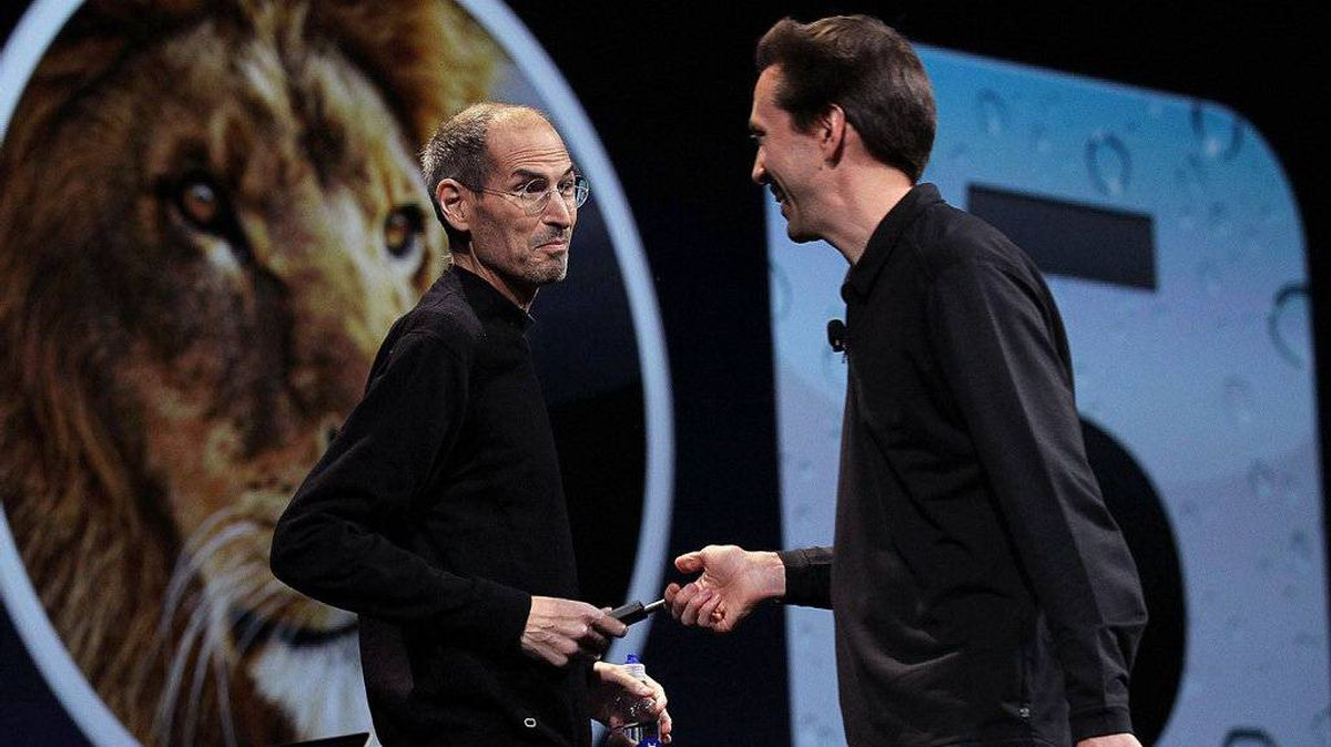
This is where the politics come in. Remember, Forstall and Jobs were boys. But without Jobs, Forstall was exposed. He didn't play well with others. Executives reportedly wouldn't sit in a meeting with him unless there was a mediator present. Jobs liked that friction. He liked pitting the Mac team against the iPod team to see who could build the better iPhone software. He believed competition bred excellence. And Forstall won those battles. He dictated the look of mobile software for six generations. But when Jobs died, Forstall lost his cover. He didn't have the protection of the king anymore. With the pressure mounting and the design community turning against the "fake" textures of skeuomorphism, Apple pushed Forstall out. And the leather stitching left with him. History hasn't been kind to skeuomorphism. We look back on it now as tacky. But we shouldn't forget that Forstall left a legacy of inventive interfaces that defined Apple when it was most vulnerable. He proved that software didn't have to be sterile. The style might be dead, but the hustle it took to build it? That’s immortal.