How Apple’s Flat Design Era Ended With Big Sur’s Neomorphism
If you caught Apple’s developer conference in the summer of 2020, you saw the remix. MacOS Big Sur dropped, and the icons looked… familiar. They had the shape of iOS, sure, but they had shading. They had depth. The tech press called it "Neumorphism." It’s a subtle shift, but if you know your history, you know it’s not just a design choice. It’s a signal. It’s Apple referencing its own rich history while hinting that the UI is heading somewhere entirely new. But to understand where we’re going—and why these shadows are creeping back in—we have to look at the era immediately following Scott Forstall’s exit. The era of the Knight Commander himself, Sir Jony Ive.
The Consolidation of Power
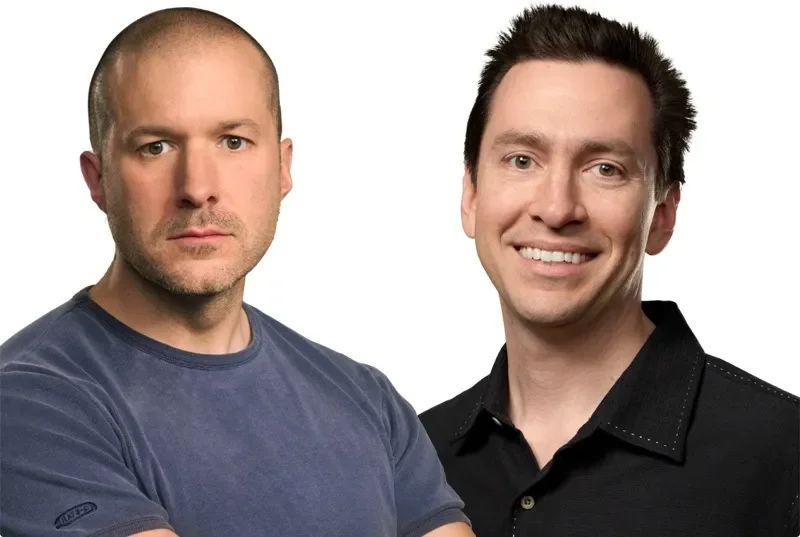
When Forstall got pushed out, the silos came down. Before 2012, Apple was a divided house. Forstall ran software (the pixels), and Jony Ive ran hardware (the atoms). When Forstall left, Apple handed the keys to the software kingdom to Ive. It was a move to unify the design language, to stop the hardware and software from speaking two different dialects. You know Ive. Or at least, you know the voice. The "alu-min-i-um." The accent so British that even Steve Jobs, his best friend and collaborator for 15 years, used to roast him for it. But make no mistake: Ive wasn’t just a narrator. He was the most powerful designer in the world. And to understand what he did to your iPhone, you have to understand who he worshiped.
The Ghost of Braun
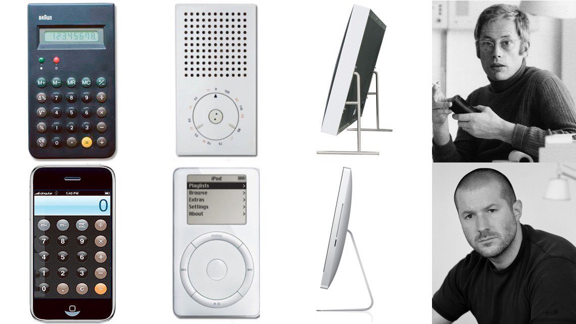
Jony Ive didn’t invent his philosophy out of thin air. He is a disciple of Dieter Rams. Rams was the legendary designer at Braun, the German consumer goods company. Rams came out of the Bauhaus tradition—the "form follows function" school of thought. It was a reaction against the heavy ornamentation of the 1800s. It was about stripping away the noise until only the essential remained. Rams designed radios, calculators, and record players that look like they could have been released by Apple today. The Braun SK4 record player? They call it "Snow White’s Coffin." It is a holy relic in the design community. When you put a Rams design next to an Ive design, the lineage is undeniable. It’s almost uncanny. Rams himself has said Apple is one of the few companies that truly understands design. Real recognize real.
Unapologetically Plastic
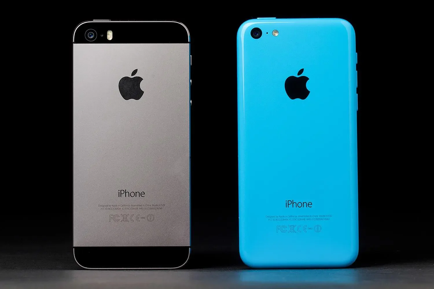
This leads us to Ive’s core principle: Material Honesty. This is the "anti-performance" stance. If a thing is made of wood, it should look like wood. If it’s metal, let it be metal. And if it’s plastic? Don't try to hide it. There is no better example of this than the iPhone 5c. When it launched in 2014, Ive called it "beautifully, unapologetically plastic." That sounds like marketing fluff, but compare it to what Samsung was doing at the time. Samsung was shipping phones with injection-molded plastic backs stamped with fake leather stitching. They were painting plastic to look like brushed metal. Samsung was "apologetically plastic." They were embarrassed by their own materials, so they put the phone in a costume. It was a cheap performance. Ive refused to play that game. He believed that plastic, treated with respect, didn't need to apologize to anyone.
The Great Flattening (iOS 7)
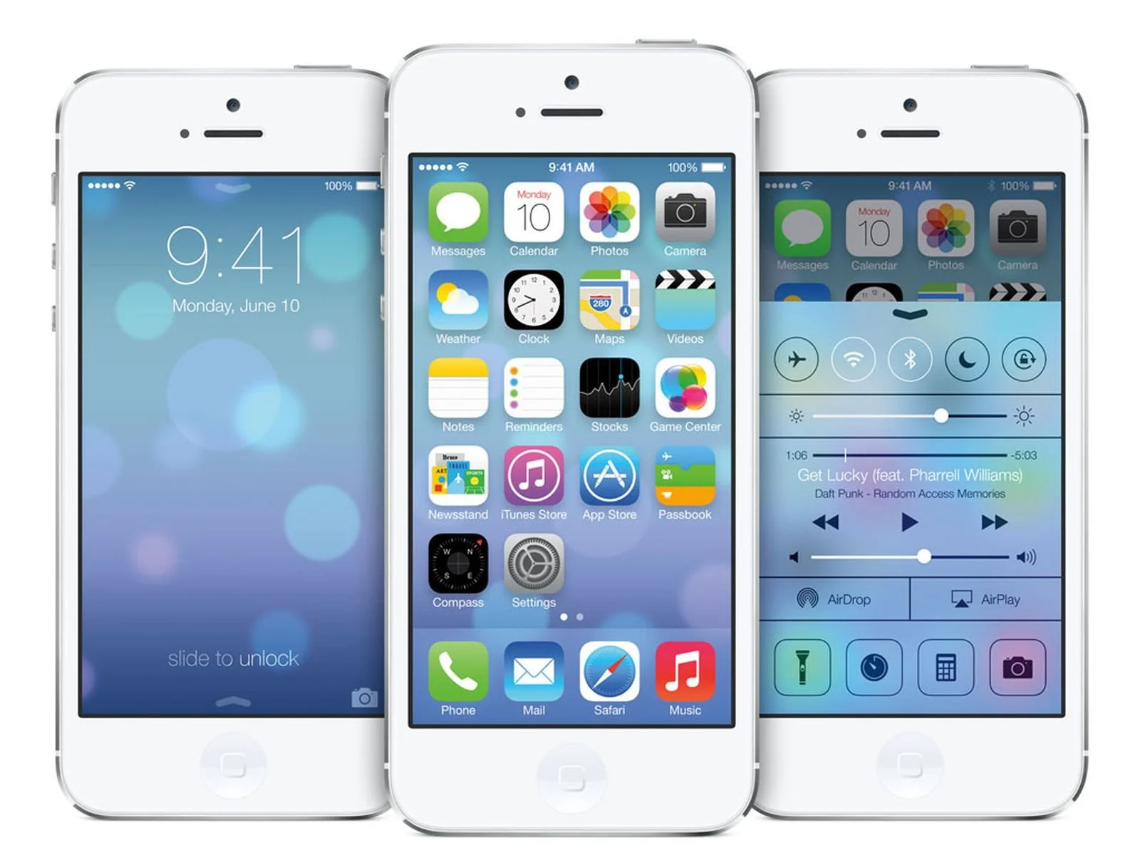
So, what happens when you give the guy obsessed with "material honesty" the keys to the software? He burns the leather calendar. He smashes the green felt card table. When iOS 7 dropped in 2013, Ive stripped the OS down to the studs. He argued that skeuomorphism—those training wheels Forstall used to get us comfortable with touch screens—was no longer necessary. We knew how to use glass rectangles now. He viewed software as a blank canvas. Software has no physical properties. It isn't wood. It isn't leather. So making it look like those things was a lie. It was dishonest. This was the "Flat Design" revolution. The Contacts app stopped looking like a book. Game Center stopped looking like a casino. It became clinical. It became white space and typography. It was a massive cultural reset. The "richness" was replaced by "order."
The Return of the Shadow (Neumorphism)
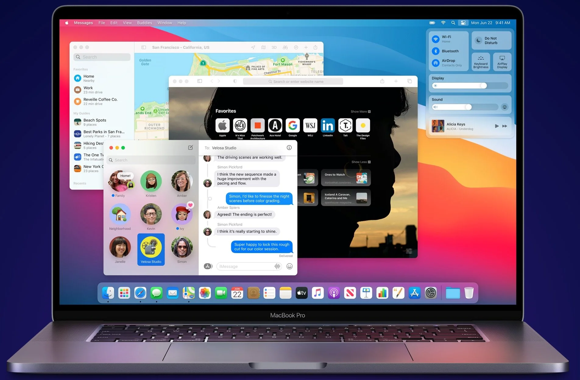
This flat look dominated for nearly a decade. But then, Big Sur happened. The shadows returned. The icons started looking like physical objects again. Why? Are we regressing? I don't think so. Look at the Messages icon in Big Sur. It’s not just a flat glyph anymore. It’s a bubble. It catches light. It casts a shadow. It reflects the color of the background. These are artifacts of physics. And this is where the theory gets interesting. I don't think this is about nostalgia. I think it's about Augmented Reality (AR). Apple is betting the farm on AR. When you project a user interface into the real world—onto your coffee table or your wall—a completely flat, shadowless square looks wrong. It looks alien. In the real world, light interacts with objects. Things cast shadows. If Apple is preparing us for a future where digital objects live in our physical space, "Neumorphism" isn't a stylistic choice. It’s a necessity. You can’t overlay a flat UI on a 3D world and expect it to feel real.
The Mic Drop
But Jony Ive won't be the one to guide us into that future. His exit in 2019 was a shock to the public, but the writing had been on the wall. He had checked out. He was designing luxury cameras and Christmas trees. He built his final monument—the massive Apple Park campus—and then he bounced. He left the way he ruled: on his own terms. He consolidated power, killed the skeuomorph, flattened the internet, built a spaceship, and then transitioned to a consultancy role with his buddy Marc Newson. His legacy is complicated, but it’s undeniable. Whether you’re on an iPhone or an Android, the device in your pocket looks the way it does because of Jony Ive. He shifted the culture. Now, the question is whether Apple can keep the soul of the machine alive without its ghost.