How Apple’s Flat Design Era Ended With Big Sur’s Neomorphism
Flat design dominated Apple from 2013 to 2020. It erased skeuomorphism overnight, aligned software with Jony Ive’s material honesty, and reshaped the entire industry. But flatness eventually hit a wall. Big Sur marked the pivot. Shadows returned. Depth returned. Icons gained dimensionality. Not skeuomorphism. Not pure flatness. Something new. Neomorphism, shaped by AR ambitions and Apple’s evolving design leadership, became the bridge to the next era.
The Aftermath of Skeuomorphism
When we last left Apple, Jony Ive had flattened skeuomorphism overnight. If you missed that chapter, you can read the full breakdown in Part 1: Apple’s UI Design From Aqua to iOS 7.
For years, that flat look held steady. From the iPhone to the iPad to the Mac, Apple committed to the idea that digital interfaces should not pretend to be physical objects. It became the company’s default language and the industry’s copy-and-paste aesthetic.
But every design era has an expiration date. Apple’s flat era lasted seven years. Long enough to define a generation. Long enough to show its limits.
The first cracks appeared in 2020.
Big Sur: A Quiet Shift
WWDC 2020 was one of the strangest, quietest keynotes Apple ever produced. No stage. No applause. No crowd. Just a stream.
Inside that calm presentation, a quiet shift appeared.
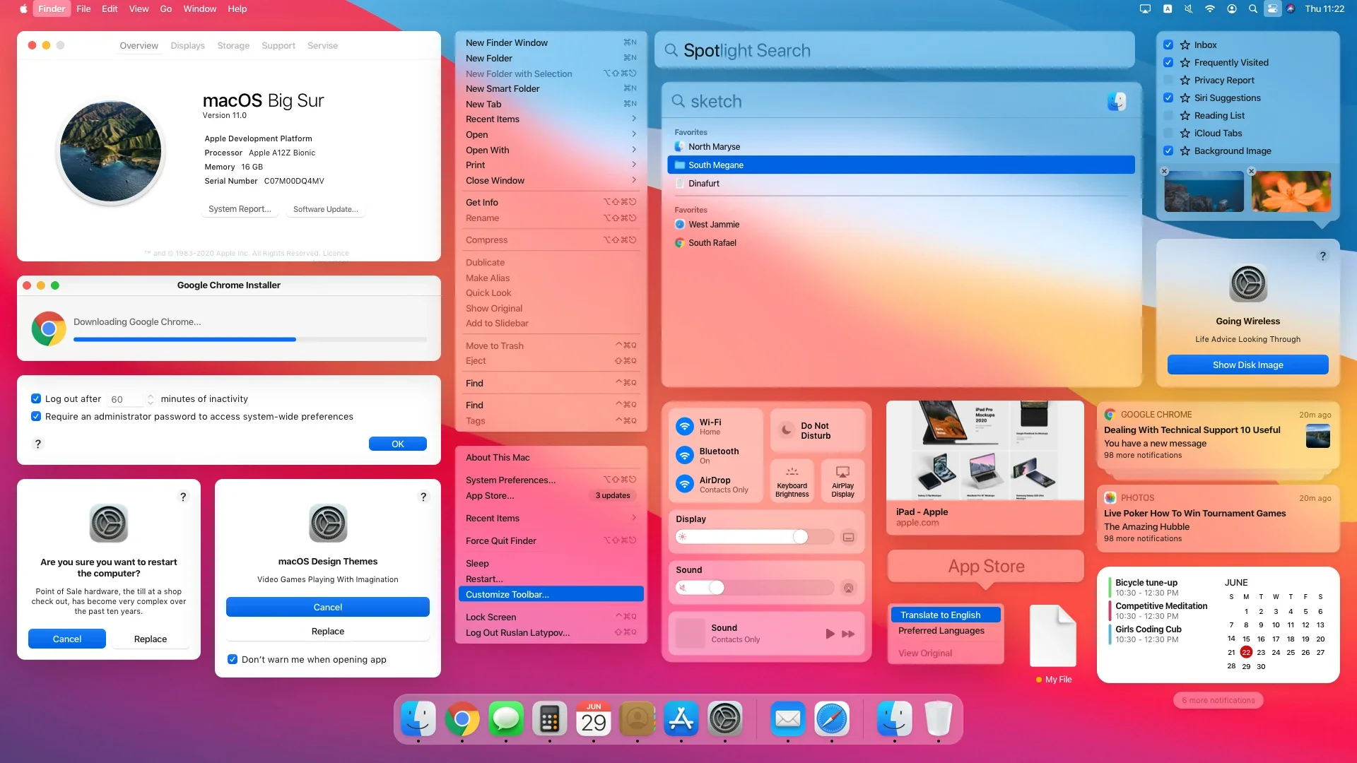
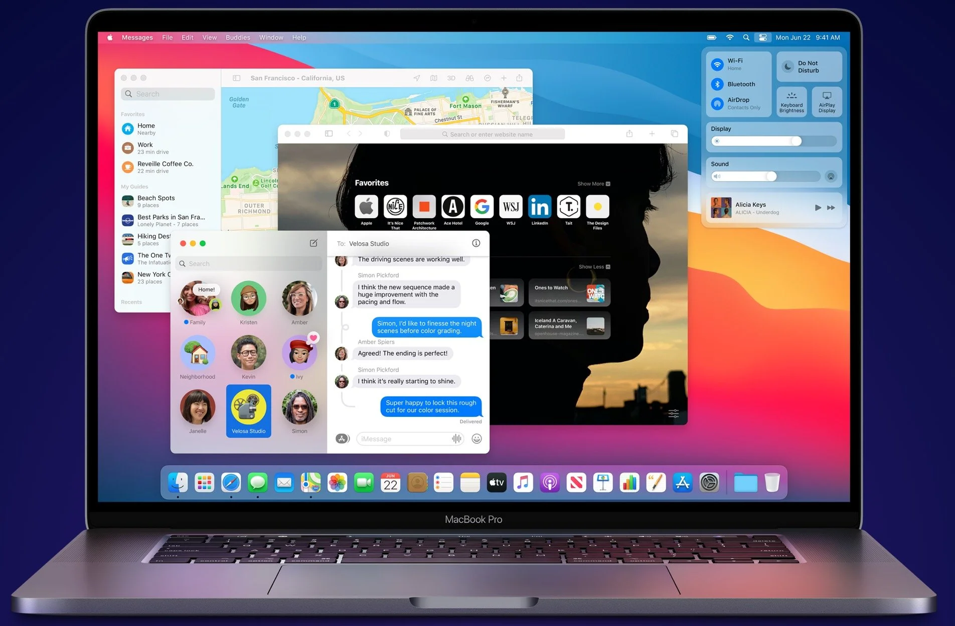
The macOS Big Sur icons did not look flat anymore.
They had soft highlights. They had subtle shadows. They looked like objects that could exist, not just shapes printed on glass. They were not skeuomorphic replicas, but they were not flat glyphs either.
It was the first visible sign that the pendulum was swinging again.
Neomorphism. A middle ground between realism and flat geometry. The start of a new chapter.
To understand why Big Sur looked like this, you have to rewind the clock.
Exit Forstall, Enter Ive
The story begins in 2012.
Scott Forstall, the man behind Aqua, linen textures, stitched leather, green felt, and iOS’s skeuomorphic personality, left Apple abruptly. Depending on the retelling, he was pushed out over Apple Maps, personality conflicts, or the fact that nearly everyone inside the company was tired of fighting him.
When he left, Apple did the unthinkable. They gave control of software design to Jony Ive.
This move mattered because Ive had been Apple’s hardware architect. The iMac. The iPod. The iPhone. The iPad. All born out of his studio. He worked in metal, glass, plastic, and light. He did not design interfaces.
Suddenly, he owned both.
And if you know Ive’s worldview, you immediately know where flat design came from.
That moment marked the end of Apple’s skeuomorphic era and the beginning of its minimalist reset. The full background sits in Part 1’s look at the Ive–Forstall clash.
The Ghost of Dieter Rams
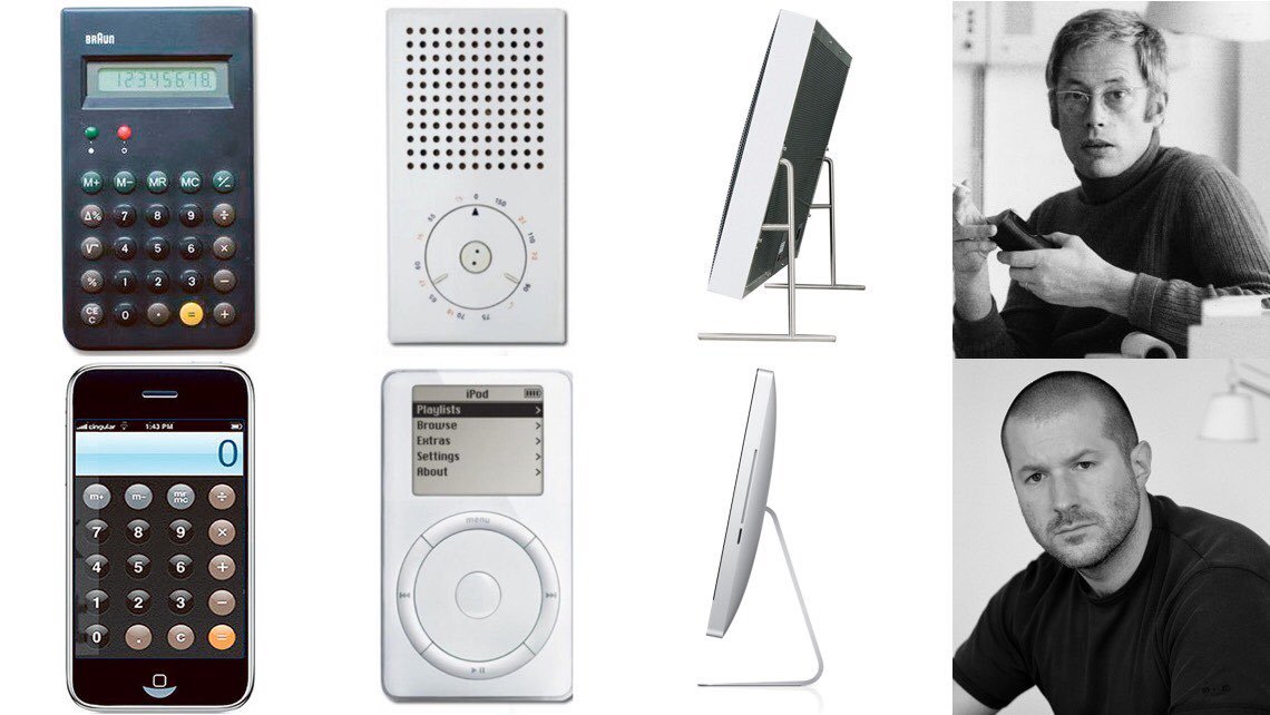
Ive’s work sits in the shadow of Dieter Rams, the Braun designer who shaped the entire modernist tradition Apple pulls from.
Rams pushed a simple truth. Materials should be honest. Form follows function. Decoration is noise. A design should not lie about what it is made of or what it does.
Rams designed calculators, radios, and record players. Clean. Intentional. Quiet. The ET66 calculator became so iconic that Apple’s original Calculator app looked like a digital tribute.
This is the lens Ive brought to software.
If leather is not real leather, do not pretend it is. If stitching is not real stitching, remove it. If textures are fake, they are dishonest.
Skeuomorphism offended his belief system.
Unapologetically Plastic
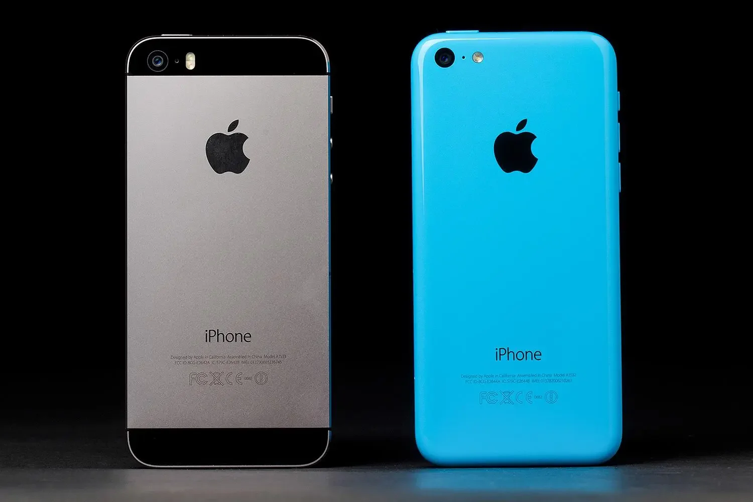
The best example of Ive’s philosophy in hardware was the iPhone 5C. A colorful, mass-market device that he described as “beautifully, unapologetically plastic.”
People joked about that line for years. But it revealed the entire worldview. Take a material and present it honestly. Do not fake metal. Do not fake leather. Do not fake wood.
The same logic hit software as soon as he took over.
The Flat Reset of iOS 7
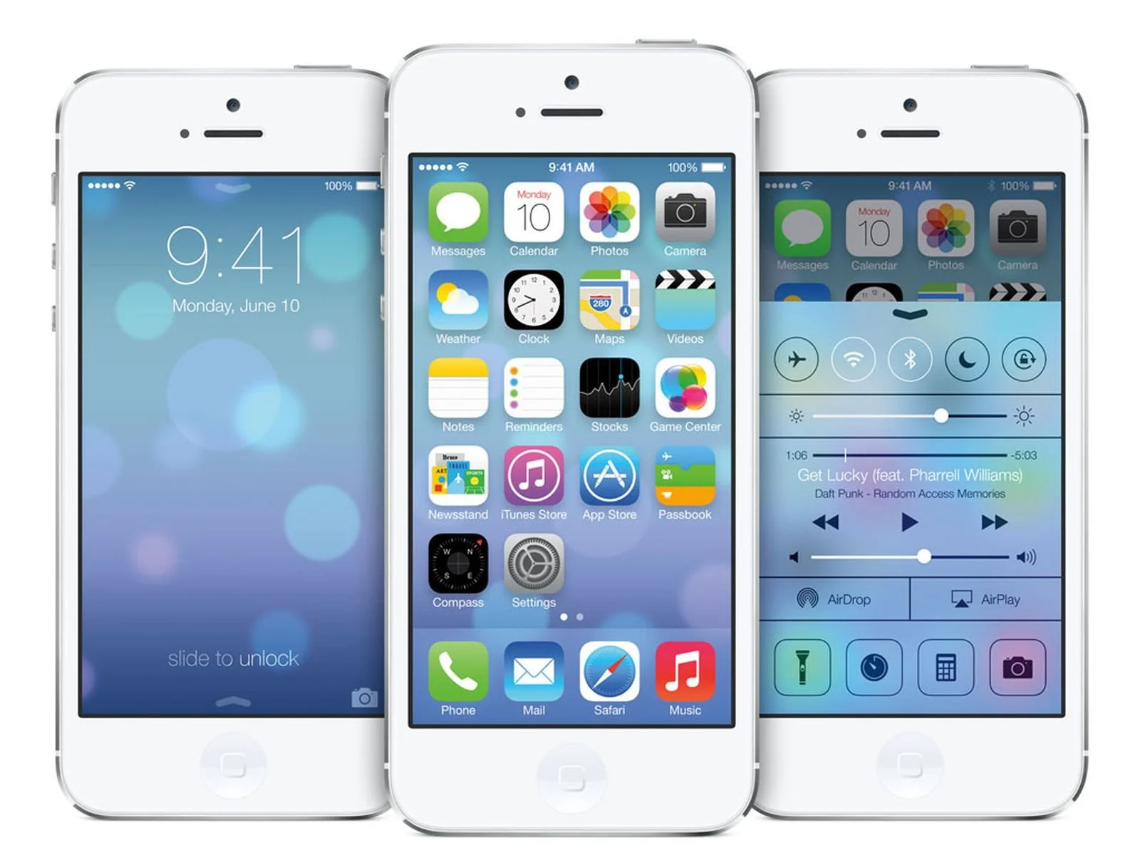
In 2013, Apple detonated skeuomorphism and introduced iOS 7. Overnight, textures disappeared. Shadows evaporated. The heavy metaphor world Forstall built was gone.
White backgrounds. Vibrant gradients. Thin lines. Helvetica Neue Ultra Thin. Everything light enough to feel like it was floating in air.
Critics called it sterile. Others called it bold. Either way, it was the biggest visual reset in the history of iOS.
Ive explained the shift simply. People no longer needed metaphors to learn how to use a touchscreen. By 2013, tapping glass was second nature. The design could mature. It could stop imitating physical objects.
Free from those constraints, apps became abstract. Photos became a color wheel. Notes became clean paper. Contacts lost its stitched notebook. The real world no longer dictated the digital one.
Yosemite: The Mac Gets Pulled In
One year later, Yosemite brought the flat design language to the Mac.
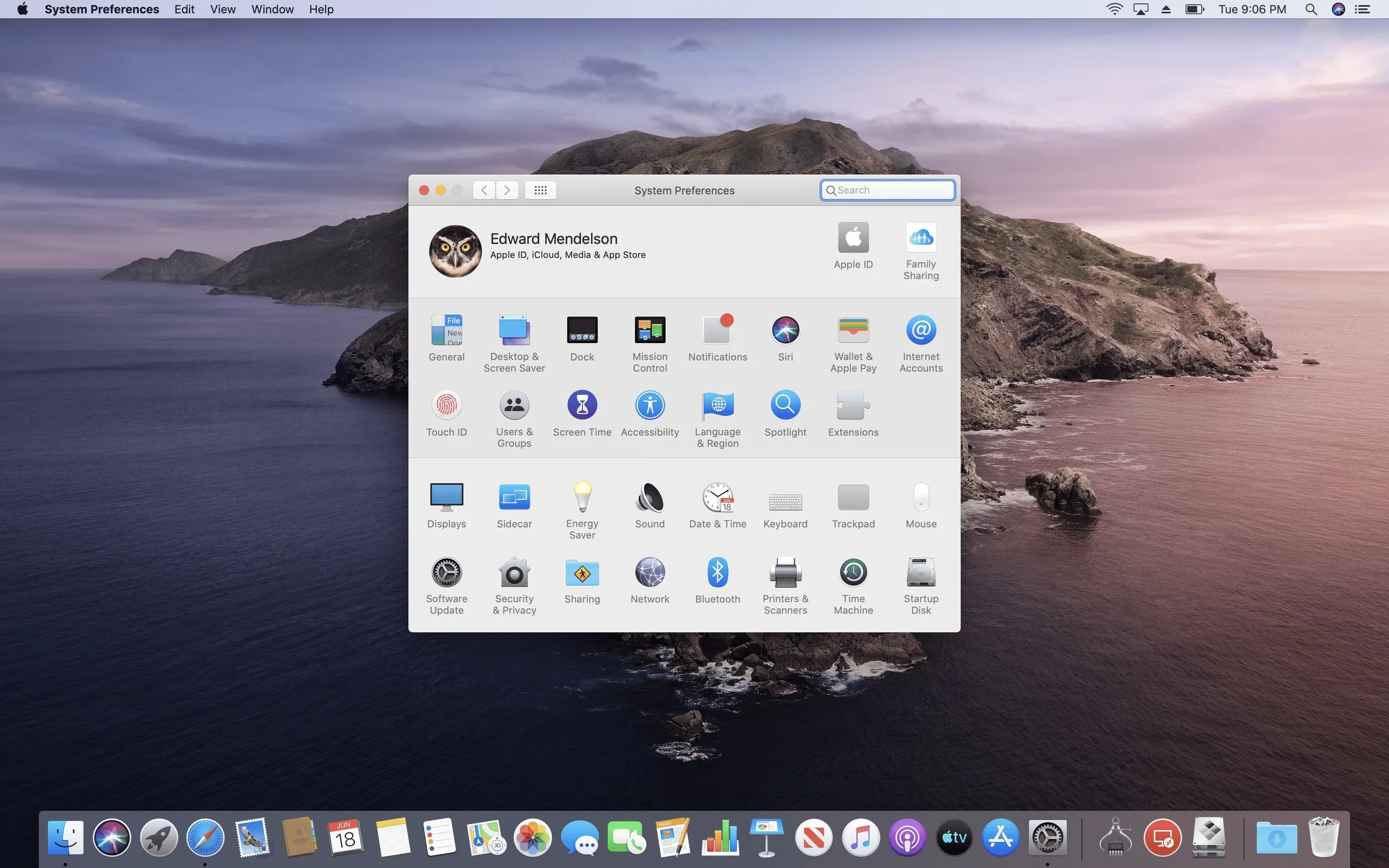
It was the first major overhaul of Mac icons since Aqua launched in 2001. Shadows were reduced. Textures flattened. Buttons simplified.
But the Mac resisted a total flattening. Finder still smiled. Mail still resembled an envelope. Preview still featured a magnifying glass. The icons were not realistic anymore. They were stylistic caricatures of their former selves.
This hybrid look stuck for six years. It survived El Capitan, Sierra, High Sierra, Mojave, and Catalina. A long era of compromise.
Then Big Sur arrived.
Big Sur: Shadows Return
Big Sur was the moment Apple reintroduced depth.
Open Messages. On iOS, it was flat. On macOS Big Sur, the icon suddenly behaved like a real object. Highlights curved. Shadows sat underneath. Light bounced off the surface. The icon’s background color changed as if light existed somewhere outside the screen.
This was not skeuomorphism. But it was not flat design.
It was neomorphism. A visual language built on subtle realism, clean geometry, soft lighting, and intentional depth.
For the first time in years, macOS and iOS felt aligned. Same visual family. Same spatial logic. Same dimensional cues.
It was not nostalgia. It was preparation.
Big Sur’s icons, with their shadows and dimensional cues, became the first obvious sign that flatness would not last forever. This shift sets the stage for what comes next in Part 3: iOS and VisionOS Bring Depth Back.
Why Big Sur Looked Like This: AR and the Future
This transition was strategic.
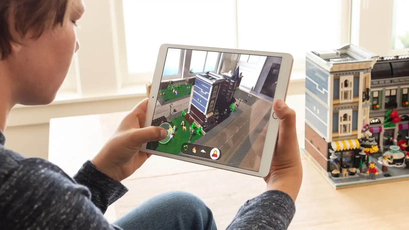
By 2020, Apple’s augmented reality vision was not a rumor. ARKit was mature. Developers were building depth-based interfaces. Headset leaks were constant.
Flat design makes sense on a 2D screen. In AR, flat shapes look wrong. No object in the real world is perfectly flat with no shadow or light.
Neomorphism fixes that problem. It creates interface elements that behave like real objects. Not photorealistic, but plausible.
Icons that feel like they could exist in real space are the first step toward UI that belongs in AR.
Ive’s Long Goodbye
Here is the twist. Jony Ive was not at Apple when Big Sur shipped.
By 2019, he had left the company. After nearly thirty years and a legacy that shaped modern computing, he stepped away to launch LoveFrom with Marc Newson. Apple was their first client.
Even without Ive’s physical presence, his influence remained through the team he built.
The Team He Left Behind
Apple’s design team was famously stable. In more than a decade, only two people left the industrial design group. One was for health reasons.
That continuity carried into software. Flat design began after Forstall’s departure. Neomorphism emerged after Ive’s departure. Each shift aligned with leadership changes, not random aesthetic whims.
Apple’s visual language moves in eras. Those eras track with the people in charge.
Shadows as Signals
So, where does Apple stand now?
Flatness did not fail. It simply reached the end of its usefulness. Big Sur’s shadows signaled the next era, one shaped by new devices, new contexts, and new expectations.
The future of Apple’s UI will not be flat. It will not be fully skeuomorphic. It will sit in a space that blends clarity, depth, and spatial realism.
The hints are already there.
A faint reflection. A soft gradient. A lifted edge. Shadows that behave like physics, not graphics.
Apple is preparing for a world where software does not sit behind glass. It sits beside you. Around you. In the real world.
Sometimes the next era does not arrive with a slogan. Sometimes it arrives as a shadow.
To see how Apple pushed depth even further with VisionOS and the return of physicality, continue the series here.
Read Part 3: The End of Flat Design.
