The Complete History of Apple’s UI Design: From Lickable Skeuomorphism to Legendary Minimalism
Apple’s early software looked real on purpose. Skeuomorphism helped people trust new technology through familiar visual metaphors. Scott Forstall championed it. Jony Ive hated it. The iPhone scaled it. Apple eventually flattened everything. Now depth is creeping back in. The full story explains why.
How Apple’s Design Became Lickable
Apple’s 2020 WWDC stream was all quiet energy. No crowd. No stage. No drama. Just a pandemic-era keynote flowing by. Then, tucked inside the presentation, something subtle shifted.
The icons had depth again.
Not full Aqua gloss. Not iOS 7 geometry either. Just enough shading to make them feel like real objects. Designers spotted it in seconds.
It wasn’t skeuomorphism reborn. And it wasn’t strict flat design. It was the start of a new era that eventually picked up a name: neomorphism.
To understand how Apple landed on this middle ground, you have to go back to the late 1990s. Apple was drowning. Steve Jobs was walking back in the door. And a young engineer named Scott Forstall was about to reshape the visual language of modern software.
The Return of Jobs. The Rise of Forstall.
In 1996, Apple was sliding toward the grave. Ninety days of cash left. Hardware nobody wanted. A lineup nobody understood.
Jobs returned with NeXT under his arm. NeXTSTEP became the foundation for Mac OS X. But he knew the code alone would not save the company. The software needed a visual identity that felt alive.
Enter Scott Forstall.
He interviewed with Jobs at NeXT. Jobs cut him off mid-sentence, told him he was hired, and instructed him to pretend to care about the rest of the interviews. Classic Jobs power move.
Forstall was sharp, obsessive, and detail-drunk. He kept a jeweler’s loupe on his desk so he could inspect icons down to the pixel. That is not a metaphor. That really was his workflow.
When Jobs needed a new interface for the resurrected Mac, he handed Forstall the keys.
Aqua: The Interface You Could Lick
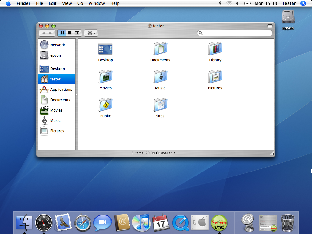
In 2001, Apple launched Mac OS X with Aqua, a software design language that arrived like a Pixar movie slipped inside a computer.
Aqua looked alive. Buttons glowed with translucency. Windows floated. Icons looked like physical objects sculpted by someone who cared too much about reflections.
Jobs walked on stage and said, with complete sincerity: “When you see it, you’ll want to lick it.”
Glassy dock reflections in 10.5. Brushed metal toolbars in 10.3. Linen textures in 10.7. Light, shadow, texture. The whole thing was unapologetically three-dimensional.
A Pixar influence makes sense. Jobs was running Pixar at the same time, and the techniques used to make toys feel alive on-screen fed directly into Aqua’s visual language.
Aqua set the foundation for the next decade of Apple’s software design, and it shaped how the company approached realism until the flat era arrived with iOS 7 and the rise of flat design.
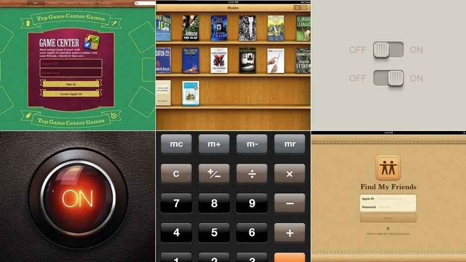
The iPhone Era: Skeuomorphism in Your Pocket
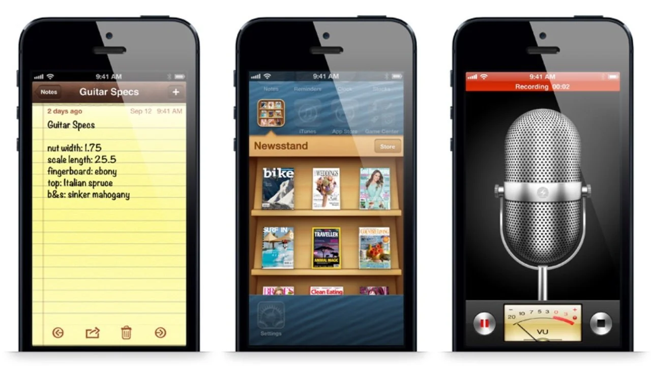
When Apple built the iPhone, Jobs again put Forstall in the driver seat. Aqua ideas came with him.
Notes looked like a legal pad. Contacts looked like a leather address book. Calendar had stitching. iBooks turned pages like a hardcover.
Skeuomorphism lowers the barrier to learning. New technology feels less intimidating when it mimics objects people already understand. Forstall believed in using the physical world to teach the digital one.
He refused to make the Contacts app expand to full height in portrait orientation. His reasoning was beautifully irrational. No one holds a book that way. Authenticity mattered more than convenience.
And consumers ate it up. By 2011, the iPhone and iPad represented nearly 70 % of Apple’s revenue. Skeuomorphism had done its job.
What Skeuomorphism Actually Is
Skeuomorphism makes digital things reference physical things.
Examples:
A trash icon that looks like a trash can.
A notepad app that looks like paper.
A Save button shaped like a floppy disk that most people using it have never touched in real life.
Skeuomorphism works until the physical object disappears. Then the metaphor stops making sense.
There is another problem. Some digital concepts have no real-world equivalent. What does a web browser look like? What does instant messaging look like? Designers end up inventing metaphors from thin air.
Sometimes Apple nailed it. Time Machine turned backups into time travel. Files drifted into a galaxy of stars. Backups felt like science fiction instead of a chore.
Other times Apple face-planted. Game Center looked like a casino table in iOS 6. Green felt. Wood trim. Zero connection to what the app actually did.
When skeuomorphism hit, the magic was real. When it missed, it felt like a theme park version of software.
Ive vs Forstall: The Philosophical Clash
Inside Apple, tension simmered.
Forstall championed skeuomorphism. He believed emotional familiarity made technology usable.
Jony Ive, the industrial designer behind Apple’s hardware, despised skeuomorphic decoration. He believed materials should be honest. Metal should look like metal. Glass should look like glass. Fake stitching made him itch.
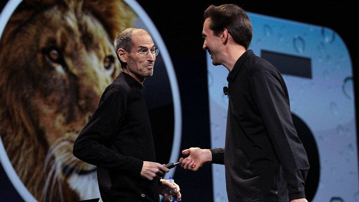
Jobs kept the rivalry productive. He thrived on friction. But after his death in 2011, Forstall lost his protector. His aggressive style rubbed executives raw. Meetings got cold. Support evaporated.
When Apple Maps launched with accuracy issues in 2012, Forstall took the fall. The company showed him the door, and skeuomorphism walked out with him.
That transition became the spark for Apple’s next major shift, one you can see fully take shape in Big Sur’s neomorphic redesign.
The Legacy of Lickable Software
Forstall’s influence stretched across a decade. Interfaces shimmered. Apps borrowed from physical objects. Software felt tactile. Familiar. Friendly. It was a bridge between the old world and the new one.
Designers love to dunk on skeuomorphism now. Too much gloss. Too much ornamentation. Too many textures. But the truth is simple. Skeuomorphism helped Apple climb out of irrelevance. It helped the iPhone become the device that rewired modern life.
Even today, Apple quietly sprinkles in tiny echoes of that era. A shadow. A highlight. A subtle glow. Nothing full Aqua, but enough to hint at depth.
Flat design took over after Forstall left, but flat was never going to be the final chapter. Design swings like a pendulum. The industry always circles back to depth, hierarchy, and tactility.
Apple’s early software looked real because it needed to. Users needed familiarity to trust touchscreens, glossy icons, and computers with no manual. Skeuomorphism delivered that bridge.
What Came Next
After skeuomorphism, Jony Ive flattened everything inside Apple’s universe. iOS 7 erased the textures, gloss, stitching, and shadows in one strike. Minimalism became doctrine. Everything had to be clean, geometric, and ultralight. Apple pushed the aesthetic so hard that the whole industry treated flatness as the new absolute truth.
For a few years it looked permanent. Then the cracks showed. Flat design solved the metaphor problem, but it created a new one. Interfaces became clearer but also colder. Hierarchy weakened. Depth disappeared. Entire apps started looking interchangeable. When everything is flat, nothing stands out.
And that is where the next chapter begins.
By the late 2010s, Apple quietly shifted again. Subtle shadows returned. Highlights crept back. Shapes softened. The pendulum moved. When macOS Big Sur arrived, the shift was undeniable. The icons looked like they were lit from somewhere. Not full skeuomorphism. Not pure flat design. Something in between.
Neomorphism. The sign that the flat era was ending.
If you want to see how Apple flattened its entire OS and then walked away from flatness years later, the next chapter breaks it down.
Read Part 2: How Apple’s Flat Design Era Ended With Big Sur’s Neomorphism.